This is my mood board for my target audience. There is a picture of gigs because most of the people who read about metal and rock in a magazine also enjoy seeing it live. Download festival is on there because it is one of the main festivals that people go to.
Because the target audience is lower middle class teenagers and below, there is a picture of what the average teenager would look like. There are also some pictures of different bands playing who would most likely be in the magazine.
Friday, 16 November 2012
Thursday, 15 November 2012
Monday, 12 November 2012
Feature article 2
Fonts: The fonts are big and bolded for the title so that it stands out. The readers attention will be directed to that portion of the text first. The main portion of the article is in smaller more plain text so that it is easy to read means theres a lot of it.
Image: The image takes up half of the page and is associated with the article. In this case it is because the man in the picture is the one being interviewed. It lets readers visualise him as they are reading what he has to say
Colours: The colours are a mix of grey, white and pink. These colours go well together and don't contrast thus giving it a professional feel. Because there are only 3 colours used that means the article is not saturated with colour and made hard to read.
Advertiser mood board
The advertiser on this mood board tie in with the target audience of lower middle class and below teenagers. HMV would advertise because they sell music. Most people of that age regularly visit KFC. Ipods are also advertised due to them playing music. There would also be albums and new video games advertised because people of that age are interested in those
Colours mood board
These are a few of the colours that can be used in a magazine. Obviously not all of these can be used at the same time or it would contrast too much. A few of these paired together however would work quite well such as black and white, yellow and blue or red and white.
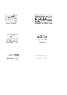
Font mood board
Here are lots of fonts that can be used in a magazine in order to give it a bit of style or to stop the readers from getting bored. There are many simple or complicated fonts that can be used in different situations and in titles or the writing of articles
Feature article 1
Picture: The picture immediately grabs the readers attention due to them probably wondering what is actually going on in it. It looks like oil is being poured all over the man or woman in the picture. It fills up half the page but still leaves plenty of room for writing. It also is relevent to the article
Font: There are a couple of different fonts in this article. The font in the headings is slightly slanted and gives it a bit of style to attract the reader. The main text is in a more plain font so that it is easier to read and so that people can understand it. It looks like most articles in that aspect
Colours: The colours are very plain in this article but it also gives it a professional and more mature look. There are only a couple of colours in this picture but it works well as it is quite a serious article. More colours would be out of place in this article
Subscribe to:
Comments (Atom)


