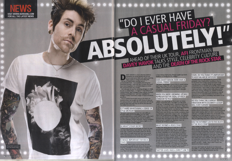
Image: The image takes up half of the page and is associated with the article. In this case it is because the man in the picture is the one being interviewed. It lets readers visualise him as they are reading what he has to say
Colours: The colours are a mix of grey, white and pink. These colours go well together and don't contrast thus giving it a professional feel. Because there are only 3 colours used that means the article is not saturated with colour and made hard to read.
No comments:
Post a Comment