Fonts: The fonts are big and bolded for the title so that it stands out. The readers attention will be directed to that portion of the text first. The main portion of the article is in smaller more plain text so that it is easy to read means theres a lot of it.
Image: The image takes up half of the page and is associated with the article. In this case it is because the man in the picture is the one being interviewed. It lets readers visualise him as they are reading what he has to say
Colours: The colours are a mix of grey, white and pink. These colours go well together and don't contrast thus giving it a professional feel. Because there are only 3 colours used that means the article is not saturated with colour and made hard to read.
Showing posts with label 1. Research and Planning. Show all posts
Monday, 12 November 2012
Feature article 1
Picture: The picture immediately grabs the readers attention due to them probably wondering what is actually going on in it. It looks like oil is being poured all over the man or woman in the picture. It fills up half the page but still leaves plenty of room for writing. It also is relevent to the article
Font: There are a couple of different fonts in this article. The font in the headings is slightly slanted and gives it a bit of style to attract the reader. The main text is in a more plain font so that it is easier to read and so that people can understand it. It looks like most articles in that aspect
Colours: The colours are very plain in this article but it also gives it a professional and more mature look. There are only a couple of colours in this picture but it works well as it is quite a serious article. More colours would be out of place in this article
Wednesday, 24 October 2012
Contents page 2
Colours: The colours used are very basic and leave the page
looking very simple although it works very well. Simple and effective and
appeals to a more mature audience with the dark, plain colours
Image: The image is meant to be very seductive and will appeal
to a male audience of all ages. It also fits in with the more mature feature of
the colouring and goes well with it. It fills up most of the page but still
leaves plenty of room for the title and the articles.
Font: The colour of the text is the opposite colour to the
background that it’s on. The white text in the title contrasts against the
black background and the black text of the articles contrasts against the
whiter background.
Things they didn’t use: They did not include a note from the
editor in this contents page unlike some others do. They did also not include
any pictures from the articles to show what would be featured in them.
Contents page 1
Colour: The colours are a mix of dark and light so that it
stands out. Yellow is used to make the headings recognisable so that peoples
eyes immediately go to them. The background is white so that the text can be
read on it easily and so that people don’t have to strain their eyes
Image: The image takes up most of the top half of the page
and is the first thing that most people who open the magazine will look at
first. Slash is recognisable to most people and people who want to read the
article about him will know what page to turn to.
Font: The font is mostly the same size all throughout the
page. This is so that it doesn’t get hard to read and text can be made out
clearly. The headings are slightly bigger so that they stand out.
Layout: All of the writing for the page is at the bottom and
is separated from the picture so that people can concentrate on the text. It is
laid out into columns like most magazines so it is following the codes of
convention
Wednesday, 10 October 2012
Front cover analysis 3
Masthead: The masthead is recognisable from far away and for
fans of the magazine. It is very plain and doesn’t distract from the picture.
Its aim is to let people know the name of the magazine
Colours: The colours used are all quite dark but go together well.
They match the image on the front page and similar colours are used for the
person and the magazine colour are similar. They make the magazine look very
dark.
Image: The image fills up most of the page and lets you know
whos going to be featured in the magazine. It still leaves space for text to be
at the side of the page though.
Target audience: I think the target audience for the
magazine would be lower middle class and below teenagers and would be evenly
spread throughout boys and girls
Promises: The magazine lets you know whos going to be in the
magazine but other than that it doesn’t promise anything exclusive or much more
than that
Front cover analysis 2
Masthead: The masthead is instantly recognisable from far
away as it is in a large white box which stands out against the background.
This is done to attract people’s attention and get them to look at the
magazine. It is also instantly recognisable as it’s the xbox logo which many
people know
Colours: The colours used are very bright and colourful
which can attract people’s attention and look at the magazine. It also appeals
to the target audience which would be lower middle class and under boys. The
bright colours make it look exciting and the choice of colours complement each
other well and make the cover look fun
Image: The image fills up most of the cover and allows
itself to be seen from far away. The image will appeal to people who like the
game and also because the character is based on Jack Black, other people may
recognise it too. The axe he is carrying is meant to look cool and succeeds in
doing so. It may get people interested in seeing more of the article and then
buying the magazine. It still leaves room for text at the side but does its job
of filling up the free space.
Promises: The
magazine promises an exclusive review for a new game and expert strategies from
the company that created the game. This may get people to buy the magazine as
they would want to see the article that no other magazine had. The magazine
also promises another review which is ‘world exclusive’. This article
accompanies the cover photo and helps to attract people to the magazine with
something interesting to read.
Other: The bar code is kept out of the way and is coupled
with a logo in a white box. This lets people know that it is a separate part of
the magazine and not one to really be looked at
Front cover analysis 1
Masthead
The masthead will always use the same font, style and size.
This is done so that the audience will always recognise the magazine and be
able to spot it straight away. The white text in the black background makes it
stand out from far away
Colours
The colours on this magazine are a mix of light and dark
which contrast each other well. The magazine is aimed at lower middle and class
and under teenagers so this is why the magazine is full of bright colours which
can catch people’s attention from far away. The dark colours are used in
people’s clothes and the masthead to make it stand out from the text.
Release
The magazine is released weekly so that they get people
buying it each week and a constant supply of money. Because it is released
weekly, the price is only around £2. This is done so that it doesn’t get too
expensive to buy while still making Kerrang some money.
Promises
The magazine promises that you can win a meet and greet with
You Me At Six. By doing this they might be able to get some people to buy the
magazine who want to win that prize. This can get them more sales and more
readers for the magazines. The magazine also includes posters that people may
want. This gives people and incentive to buy the magazine over other ones in
order to get something that they want.
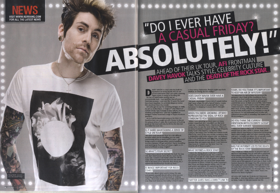
Pictures
The picture on the front of the magazine fills up most of
the page. This is done to catch people’s attention and get them to buy the
magazine. By putting the readers favourite bands on the front cover they can
ensure that people will buy the magazine in order to read about them. In this
case it features Rou from Enter Shikari and Itch from The King Blues, who
people may like.
Subscribe to:
Posts (Atom)


