Tuesday, 11 December 2012

Magazine case study


There are many things that you can say about a magazine and its history. How it has developed, how it uses technology, the relation to the audience, the advertisers and the funding. The music magazine that I am analysing is called Kerrang.

History

Kerrang was first published on the 6th June 1981. At first it focused on the new British Heavy Metal movement but later broadened out to other types of metal and rock. It rose in popularity in the early 2000’s and became a best selling music magazine.

The rights were sold in 2009 to the Bauer Media Group who overlook the publication of the magazine.

Content

Kerrang features articles about bands and events, usually in the metal or rock genre. There are a few articles about bands in each issue, upcoming gigs and news about what is happening. The feature article is always shown on the front of the magazine and will be the most recognisable from far away. The feature articles are usually a double page spread but sometimes they can span over 4 pages.

There are also other smaller articles included in the magazine; some of these will be advertised on the cover, but not all due to not enough space. Other sections include letters sent in by readers, gig reviews and what is featured next week.

Demographic

The magazine is mainly marketed towards teenagers of both genders. The market is more niche than other music magazines due to the type of music inside isn’t listened to by the majority of people. The writing style fits in with the demographic of the magazine.

Friday, 16 November 2012

Target Audience mood board

This is my mood board for my target audience. There is a picture of gigs because most of the people who read about metal and rock in a magazine also enjoy seeing it live. Download festival is on there because it is one of the main festivals that people go to.
Because the target audience is lower middle class teenagers and below, there is a picture of what the average teenager would look like. There are also some pictures of different bands playing who would most likely be in the magazine.

Monday, 12 November 2012

Feature article 2

Fonts: The fonts are big and bolded for the title so that it stands out. The readers attention will be directed to that portion of the text first. The main portion of the article is in smaller more plain text so that it is easy to read means theres a lot of it.

Image: The image takes up half of the page and is associated with the article. In this case it is because the man in the picture is the one being interviewed. It lets readers visualise him as they are reading what he has to say

Colours: The colours are a mix of grey, white and pink. These colours go well together and don't contrast thus giving it a professional feel. Because there are only 3 colours used that means the article is not saturated with colour and made hard to read.

Advertiser mood board

The advertiser on this mood board tie in with the target audience of lower middle class and below teenagers. HMV would advertise because they sell music. Most people of that age regularly visit KFC. Ipods are also advertised due to them playing music. There would also be albums and new video games advertised because people of that age are interested in those

Colours mood board

These are a few of the colours that can be used in a magazine. Obviously not all of these can be used at the same time or it would contrast too much. A few of these paired together however would work quite well such as black and white, yellow and blue or red and white.

Font mood board

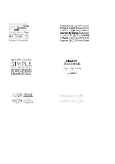
Here are lots of fonts that can be used in a magazine in order to give it a bit of style or to stop the readers from getting bored. There are many simple or complicated fonts that can be used in different situations and in titles or the writing of articles

Feature article 1

Picture: The picture immediately grabs the readers attention due to them probably wondering what is actually going on in it. It looks like oil is being poured all over the man or woman in the picture. It fills up half the page but still leaves plenty of room for writing. It also is relevent to the article

Font: There are a couple of different fonts in this article. The font in the headings is slightly slanted and gives it a bit of style to attract the reader. The main text is in a more plain font so that it is easier to read and so that people can understand it. It looks like most articles in that aspect

Colours: The colours are very plain in this article but it also gives it a professional and more mature look. There are only a couple of colours in this picture but it works well as it is quite a serious article. More colours would be out of place in this article

Wednesday, 24 October 2012

Contents page 2


Colours: The colours used are very basic and leave the page looking very simple although it works very well. Simple and effective and appeals to a more mature audience with the dark, plain colours

Image: The image is meant to be very seductive and will appeal to a male audience of all ages. It also fits in with the more mature feature of the colouring and goes well with it. It fills up most of the page but still leaves plenty of room for the title and the articles.

Font: The colour of the text is the opposite colour to the background that it’s on. The white text in the title contrasts against the black background and the black text of the articles contrasts against the whiter background.

Things they didn’t use: They did not include a note from the editor in this contents page unlike some others do. They did also not include any pictures from the articles to show what would be featured in them.

Contents page 1


Colour: The colours are a mix of dark and light so that it stands out. Yellow is used to make the headings recognisable so that peoples eyes immediately go to them. The background is white so that the text can be read on it easily and so that people don’t have to strain their eyes

Image: The image takes up most of the top half of the page and is the first thing that most people who open the magazine will look at first. Slash is recognisable to most people and people who want to read the article about him will know what page to turn to.

Font: The font is mostly the same size all throughout the page. This is so that it doesn’t get hard to read and text can be made out clearly. The headings are slightly bigger so that they stand out.

Layout: All of the writing for the page is at the bottom and is separated from the picture so that people can concentrate on the text. It is laid out into columns like most magazines so it is following the codes of convention

Questionnaire analysis


We conducted a student questionnaire before attempting to produce a college magazine. We did this so that we could find out what sort of things people wanted in the magazine. The results we got were that 50% of the people we questioned were male and 50% were female.

90% of the people that we asked do not read the current college magazine

The main things that people wanted to be included in the magazine are fashion, music, job advice and sport

60% of people said that the magazine should be released every month and this was the majority of people

60% of the people who were asked would not pay for the magazine

40% of people would contribute to the magazine In order to be a part of it

The main things that people would want on a front cover are images, bright colours, bold title and arty

The most popular choice of colours for a front cover are red, blue, purple, pink and white

Tuesday, 23 October 2012

Survey Questions


1.       Are you male or female?

2.       Do you read the college magazine?

3.       List three things you would like to see in a college magazine

4.       How often would you like the magazine published?

5.       Would you be willing to pay for a college magazine?

6.       Would you be prepared to contribute to the magazine?

7.       What features on the front cover would attract you to the article?

8.       What colours do you think would attract students to read the magazine?

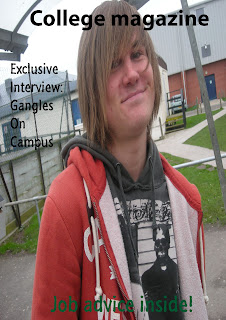
College magazine cover


LAYOUT

 There is a lot of space between the different pieces of text which makes it look less professional. Some of the text also goes over the image which makes it hard to read

MASTHEAD

The masthead is easy to read and stands out from far away

IMAGE

The image fills up most of the page and does its job of filling up space

COLOURS

The magazine uses 3 colours in all of the text

Wednesday, 10 October 2012

Front cover analysis 3


Masthead: The masthead is recognisable from far away and for fans of the magazine. It is very plain and doesn’t distract from the picture. Its aim is to let people know the name of the magazine

Colours: The colours used are all quite dark but go together well. They match the image on the front page and similar colours are used for the person and the magazine colour are similar. They make the magazine look very dark.

Image: The image fills up most of the page and lets you know whos going to be featured in the magazine. It still leaves space for text to be at the side of the page though.

Target audience: I think the target audience for the magazine would be lower middle class and below teenagers and would be evenly spread throughout boys and girls

Promises: The magazine lets you know whos going to be in the magazine but other than that it doesn’t promise anything exclusive or much more than that


Front cover analysis 2


Masthead: The masthead is instantly recognisable from far away as it is in a large white box which stands out against the background. This is done to attract people’s attention and get them to look at the magazine. It is also instantly recognisable as it’s the xbox logo which many people know

Colours: The colours used are very bright and colourful which can attract people’s attention and look at the magazine. It also appeals to the target audience which would be lower middle class and under boys. The bright colours make it look exciting and the choice of colours complement each other well and make the cover look fun

Image: The image fills up most of the cover and allows itself to be seen from far away. The image will appeal to people who like the game and also because the character is based on Jack Black, other people may recognise it too. The axe he is carrying is meant to look cool and succeeds in doing so. It may get people interested in seeing more of the article and then buying the magazine. It still leaves room for text at the side but does its job of filling up the free space.

Promises:  The magazine promises an exclusive review for a new game and expert strategies from the company that created the game. This may get people to buy the magazine as they would want to see the article that no other magazine had. The magazine also promises another review which is ‘world exclusive’. This article accompanies the cover photo and helps to attract people to the magazine with something interesting to read.

Other: The bar code is kept out of the way and is coupled with a logo in a white box. This lets people know that it is a separate part of the magazine and not one to really be looked at

Front cover analysis 1


Masthead

The masthead will always use the same font, style and size. This is done so that the audience will always recognise the magazine and be able to spot it straight away. The white text in the black background makes it stand out from far away


Colours

The colours on this magazine are a mix of light and dark which contrast each other well. The magazine is aimed at lower middle and class and under teenagers so this is why the magazine is full of bright colours which can catch people’s attention from far away. The dark colours are used in people’s clothes and the masthead to make it stand out from the text.

Release

The magazine is released weekly so that they get people buying it each week and a constant supply of money. Because it is released weekly, the price is only around £2. This is done so that it doesn’t get too expensive to buy while still making Kerrang some money.

Promises

The magazine promises that you can win a meet and greet with You Me At Six. By doing this they might be able to get some people to buy the magazine who want to win that prize. This can get them more sales and more readers for the magazines. The magazine also includes posters that people may want. This gives people and incentive to buy the magazine over other ones in order to get something that they want.

Pictures

The picture on the front of the magazine fills up most of the page. This is done to catch people’s attention and get them to buy the magazine. By putting the readers favourite bands on the front cover they can ensure that people will buy the magazine in order to read about them. In this case it features Rou from Enter Shikari and Itch from The King Blues, who people may like.