
Wednesday, 30 April 2014

Thursday, 19 December 2013


Monday, 11 March 2013
Evaluation part 5
My magazine is mainly targeted at teenage boys but a fair
amount of teenage girls would also be interested in it. I am targeting at this
at this audience because it is primarily young people who listen to this sort
of music. There are also a larger number of boys who listen to this music than
there is girls.
The class would be lower to lower middle class because anyone
of a higher class would view themselves as more cultured and not enjoy
listening to the music included in the magazine. These are the demographics for
my magazine.
The main psychographic would obviously be anybody who
listened to the hardcore or metal genre. Not many other psychographics would
influence the people who read the magazine.
A lot of the advertising would be for music or other things
that young people would be interested in like video games and fast food. There
would be no point in advertising jewellery or a new car as my target
demographic would not be interested in it.
My magazine would attract the audience by featuring articles
from the bands that they are interested in. The bright colours of the masthead
and the featured writing would make people notice the magazine from a distance
and maybe make them want to take a closer look.
The offers inside the magazine such as signed posters and
some money off next weeks issue may make people inclined to buy it or even
subscribe. Because the magazine was written by someone who is the age of the
target audience, the magazines features language which isn’t too complicated
for young people and if it features slang then the demographic will be familiar
with it.
Evaluation part 4

My product represents the particular social group of people
who like metal and hardcore by appealing to them with the bands included inside
the magazine. The pictures area also all of young people, who would be the ones
reading the magazine. I have implied that they have the qualities of having a
lot of fun and enjoying life as much as they can.
A lot of youths are stereotyped for violence in the
mainstream media and this is something I have not included in my magazine as it
helps to enforce a positive view of young people. I have neither reinforced or
challenged stereotypes but instead tried to present everyone in the magazine as
just normal people.
My pictures are all light-hearted compared to the often
serious poses in most magazines. It creates an atmosphere of light-heartedness
and everyone being friendly towards each other.
People often associate listeners of metal with dark clothing
and black hair but the picture on my front cover features a boy in a bright
orange suit. This is going against the stereotype for that particular area.
I think my magazine would be published by Bauer as they
publish a lot of music magazines but none of them have such a heavy focus on
the hardcore genre. I believe that they would want to publish it because it
would offer a broader audience for their company and get them a lot more sales.
Evaluation part 3

The magazine front cover looks like a conventional magazine
cover. I added the masthead at the top just like a normal magazine. It covers
the top of the page and isn’t too big t or too small. I also have a banner at
the top advertising something that is included inside the magazine.
The picture takes up most of the page, leaving no gaps. This
is sticking to the normal conventions along with making the picture a mid shot.
I kept to 3 colours in the front cover which were green, blue and white. These
colours went well together and didn’t clash.
Evaluation part 2

My contents
page looks like a typical music magazine contents page. It includes pictures
like conventional magazines in order to show people what they will be seeing
inside the magazine. Pictures are important as if a contents page only included
words then it would be a lot more boring to look at.
It includes
headings about each section of the magazine, grouping the pages into a section
so that it is easier to navigate. The headings had to be lined up which was
difficult or it wouldn’t have looked right.
It is
important to stick to 2 or 3 colours throughout the whole page, in this case I
stuck to green, purple and white. I picked these because I think they go well
together and make the page look presentable.
Evaluation part 1
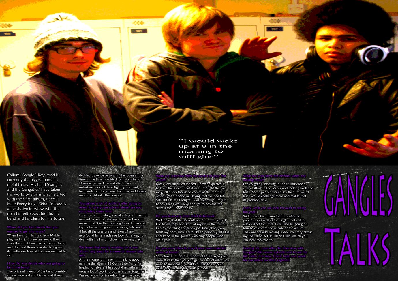
The
conventions that I have used in the feature article share some things in common
with normal magazines. I added the title at the right side of the page instead
of the usual left side. I believe that this separates it from normal magazines and
gives it a bit of difference. I kept in with the usual styles of magazines
however by making it the usual size.
I kept the
text in columns like magazines usually do and separated the interviewer
questions by putting them in a different colour. I put the pull quote inside
the picture as opposed to the usual in the middle of the text.
The picture
is at the top of my page like it is in many magazines. I think my feature
article mainly sticks to the codes and conventions presented in normal
magazines. I produced a metal/hardcore magazine and the dark colours keep in
with the usual style of that
Tuesday, 11 December 2012
Magazine case study
There are
many things that you can say about a magazine and its history. How it has
developed, how it uses technology, the relation to the audience, the
advertisers and the funding. The music magazine that I am analysing is called
Kerrang.
History
Kerrang was
first published on the 6th June 1981. At first it focused on the new
British Heavy Metal movement but later broadened out to other types of metal
and rock. It rose in popularity in the early 2000’s and became a best selling
music magazine.
The rights were
sold in 2009 to the Bauer Media Group who overlook the publication of the
magazine.
Content
Kerrang
features articles about bands and events, usually in the metal or rock genre.
There are a few articles about bands in each issue, upcoming gigs and news
about what is happening. The feature article is always shown on the front of
the magazine and will be the most recognisable from far away. The feature
articles are usually a double page spread but sometimes they can span over 4
pages.
There are
also other smaller articles included in the magazine; some of these will be
advertised on the cover, but not all due to not enough space. Other sections
include letters sent in by readers, gig reviews and what is featured next week.
Demographic
The magazine
is mainly marketed towards teenagers of both genders. The market is more niche
than other music magazines due to the type of music inside isn’t listened to by
the majority of people. The writing style fits in with the demographic of the
magazine.
Friday, 16 November 2012
Target Audience mood board

Because the target audience is lower middle class teenagers and below, there is a picture of what the average teenager would look like. There are also some pictures of different bands playing who would most likely be in the magazine.
Thursday, 15 November 2012
Monday, 12 November 2012
Feature article 2
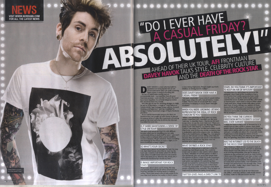
Image: The image takes up half of the page and is associated with the article. In this case it is because the man in the picture is the one being interviewed. It lets readers visualise him as they are reading what he has to say
Colours: The colours are a mix of grey, white and pink. These colours go well together and don't contrast thus giving it a professional feel. Because there are only 3 colours used that means the article is not saturated with colour and made hard to read.
Advertiser mood board

Colours mood board

Font mood board

Feature article 1

Font: There are a couple of different fonts in this article. The font in the headings is slightly slanted and gives it a bit of style to attract the reader. The main text is in a more plain font so that it is easier to read and so that people can understand it. It looks like most articles in that aspect
Colours: The colours are very plain in this article but it also gives it a professional and more mature look. There are only a couple of colours in this picture but it works well as it is quite a serious article. More colours would be out of place in this article
Friday, 26 October 2012

Subscribe to:
Posts (Atom)